The Philosophy of Color Perception – A Scientific Approach
Color is not just a visual phenomenon; it’s a complex interplay of science, psychology, and culture that shapes our understanding of the world. When we look at a vibrant sunset or a blooming flower, we don’t just see colors; we experience emotions, memories, and even cultural narratives. This article explores the intricate relationship between color perception and philosophy, delving into scientific theories, psychological implications, and cultural interpretations that shape our understanding of color in the world around us. By understanding how we perceive color, we can unravel the mysteries behind our emotional responses and cultural significances tied to various hues.
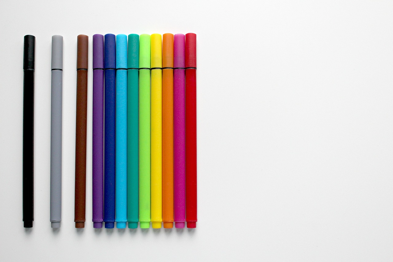
Understanding how humans perceive color involves exploring the biology of the eye, the role of light, and the brain's processing mechanisms that contribute to our experience of color. At the core of color perception is the human eye, which contains specialized cells called cones that are sensitive to different wavelengths of light. These cones allow us to detect a spectrum of colors, from the warm reds and oranges of a sunset to the cool blues and greens of a forest. But it’s not just the physical structure of our eyes that matters; the brain plays a crucial role in interpreting these signals. The processing of color occurs in the visual cortex, where our brain combines information from both eyes to create a cohesive perception of color.
Philosophers have long debated the nature of color, questioning whether it exists independently of perception or is a construct of the mind. This leads to various interpretations and theories about what color truly is. For instance, some argue that colors are inherent properties of objects, while others suggest that they are merely sensations created by our brains in response to light. This philosophical inquiry raises fascinating questions: Does a color exist if no one is there to perceive it? And how do our individual experiences shape our understanding of color?
Color is experienced through our senses, highlighting the subjective nature of perception and the impact of individual differences on how we see color. For example, two people may look at the same apple and describe it in different ways based on their unique experiences and emotional connections. This subjectivity is akin to tasting a dish; while one person may savor its sweetness, another might find it too salty. Our past experiences, cultural backgrounds, and even emotions can alter how we perceive color, making it a deeply personal experience.
The surrounding environment can significantly affect how colors are perceived, altering our interpretation based on factors like lighting, context, and cultural background. For instance, a white dress might appear blue in certain lighting conditions, a phenomenon known as color constancy. This adaptability of our perception is fascinating and highlights how our brains work to maintain a stable perception of color despite changes in the environment. Cultural background also plays a role; in some cultures, white symbolizes purity, while in others, it represents mourning.
Color blindness provides insight into the variability of color perception, revealing how differences in physiological makeup can lead to distinct experiences of color. For instance, individuals with red-green color blindness may struggle to distinguish between reds and greens, leading to a completely different interpretation of a landscape. This condition not only affects personal experiences but also emphasizes the importance of inclusivity in design and art, ensuring that color choices consider diverse perceptual experiences.
Artistic expressions often play with color to evoke emotions and convey messages, making color a crucial element in the study of aesthetics and human response. Artists like Claude Monet and Vincent van Gogh have famously used color to express feelings and moods, demonstrating that color is not just a visual tool but also a powerful medium for communication. The way colors interact and contrast can create a sense of harmony or tension, influencing how we respond emotionally to a piece of art.
Different cultures attribute various meanings to colors, influencing everything from art to fashion and shaping the way individuals and societies perceive and interact with colors. For example, in Western cultures, red often symbolizes love and passion, while in some Eastern cultures, it represents luck and prosperity. This divergence in color symbolism reveals the rich tapestry of human experience and the ways in which cultural narratives shape our understanding of color.
This subsection explores how specific colors symbolize different concepts in various cultures, highlighting the diversity of color interpretation worldwide. Here are a few examples:
- Red: Love in Western cultures, luck in China.
- Blue: Calmness in many cultures, but can symbolize sadness in others.
- Green: Nature and growth in most cultures, but can represent envy in some contexts.
Research shows that color can influence emotions and behaviors, affecting mood and decision-making, which is essential in fields like marketing, design, and psychology. For example, warm colors like red and orange can evoke feelings of excitement and urgency, while cooler colors like blue and green tend to promote calmness and relaxation. This understanding of color psychology is leveraged in various industries, from advertising to interior design, where the right color choice can significantly impact consumer behavior.
Q: What is color perception?
A: Color perception is the ability of the human eye and brain to interpret different wavelengths of light, resulting in the experience of color.
Q: Do colors have universal meanings?
A: No, colors can have different meanings in different cultures. For example, white symbolizes purity in some cultures but mourning in others.
Q: How does lighting affect color perception?
A: Lighting can dramatically change how we perceive colors. For instance, the same color can look different under natural light versus artificial light.

The Science of Color Perception
This article explores the intricate relationship between color perception and philosophy, delving into scientific theories, psychological implications, and cultural interpretations that shape our understanding of color in the world around us.
Understanding how humans perceive color involves exploring the biology of the eye, the role of light, and the brain's processing mechanisms that contribute to our experience of color. At the core of this fascinating subject lies the human eye, a complex organ that functions much like a camera. Light enters through the cornea, passes through the lens, and is focused onto the retina, where photoreceptor cells called cones and rods convert light into electrical signals. These signals are then transmitted to the brain for interpretation.
Cones are particularly crucial for color perception. They come in three types, each sensitive to different wavelengths of light corresponding to the primary colors: red, green, and blue. This trichromatic theory of color vision suggests that our perception of a wide spectrum of colors arises from the way these cones are stimulated by various wavelengths. For instance, when light of a certain wavelength hits the cones, it activates them to varying degrees, sending a unique combination of signals to the brain, which then interprets these signals as specific colors.
On the other hand, the rods play a vital role in our ability to see in low-light conditions but are not involved in color discrimination. This is why, in dim light, colors can seem muted or even disappear altogether, leaving us with a grayscale view of the world. The interaction between cones and rods illustrates the complexity of our visual system and how it adapts to different lighting conditions.
Moreover, the brain's interpretation of color is influenced by various factors, including context and surrounding colors. This phenomenon is known as color constancy, where our perception of a color remains relatively constant under varying illumination conditions. For example, a white dress may appear blue under certain lighting, yet we still recognize it as white due to our brain's ability to adjust our perception based on the surrounding colors and light sources.
The role of light cannot be overstated in the science of color perception. Different light sources emit varying wavelengths, which can dramatically alter how we perceive colors. For instance, incandescent bulbs emit a warm light that can make colors appear richer and more vibrant, while fluorescent lights can cast a cooler hue, affecting our perception of the same colors entirely. This is why artists and designers often carefully choose their lighting to enhance the colors in their work.
In summary, the science of color perception is a rich tapestry woven from biology, physics, and psychology. It reveals how our eyes and brain work together to create the vivid experiences of color we encounter daily. Understanding this intricate relationship not only deepens our appreciation for the beauty of color but also unveils the underlying mechanisms that shape our perception of the world.
- What is color perception? Color perception is the ability of the human eye and brain to interpret different wavelengths of light as distinct colors.
- How do we see colors? We see colors through specialized cells in our eyes called cones, which respond to different wavelengths of light.
- What is color constancy? Color constancy is the brain's ability to perceive colors as relatively constant despite changes in lighting conditions.
- How does light influence color perception? Different light sources can alter the appearance of colors, affecting how we perceive them in various environments.

Philosophical Theories of Color
The exploration of color perception has intrigued philosophers for centuries, prompting deep questions about the nature of reality and our sensory experiences. One of the most fundamental debates revolves around whether color exists independently of our perception or if it is merely a construct of the mind. This philosophical inquiry leads us to ponder: is color an inherent quality of objects, or is it shaped by our subjective experiences? The implications of this question are profound, influencing not only philosophical thought but also scientific investigation into the nature of perception itself.
To delve into this complex topic, we can look at two primary philosophical perspectives: realism and idealism. Realists argue that colors exist in the world as properties of objects; for instance, a red apple is red regardless of who is observing it. In contrast, idealists contend that color is a product of our perception and does not exist without an observer. This leads to a fascinating discussion about the role of consciousness in shaping our understanding of the world around us.
One of the most notable theories in this realm is the representational theory of color, which posits that colors are not properties of objects themselves but rather are ways in which our brains interpret wavelengths of light. This theory suggests that our experience of color is mediated by our sensory organs and brain processes, creating a subjective reality that may differ from person to person. For instance, while one person may perceive a color as vibrant blue, another might see it as a muted shade, demonstrating the variability in color perception.
Another compelling philosophical viewpoint is the phenomenalism perspective, which emphasizes the experience of color as a sensory phenomenon. According to this view, colors are not merely physical properties but are tied to our emotional and psychological responses to them. This raises intriguing questions about how our individual experiences—shaped by factors such as culture, personal history, and even mood—affect our perception of color. For example, the color red might evoke feelings of passion or anger in one person while symbolizing love and warmth in another.
Furthermore, the debate extends into the realm of color realism, which posits that colors exist as real properties of objects but are perceived differently based on environmental conditions and individual differences. This perspective acknowledges that while colors may have a basis in physical reality, our interpretation is influenced by a myriad of factors, including lighting, context, and even cultural background. This leads to the fascinating conclusion that our understanding of color is not just a simple reflection of the world, but a complex interplay between perception, cognition, and culture.
To summarize, the philosophical theories of color perception highlight the intricate relationship between reality and our sensory experiences. As we navigate through these perspectives, we are reminded that our understanding of color is a blend of objective properties and subjective interpretations. The ongoing dialogue between philosophers, scientists, and artists continues to enrich our comprehension of this vibrant aspect of human experience.
- What is the difference between realism and idealism in color perception?
Realism asserts that colors exist as properties of objects, while idealism claims that colors are dependent on the observer's perception. - How does culture influence color perception?
Cultural background can significantly alter the meanings and emotional responses associated with different colors. - Can color perception vary from person to person?
Yes, individual differences, including physiological makeup and personal experiences, can lead to distinct perceptions of color.

Color as a Sensory Experience
Color is not just a visual phenomenon; it's a rich sensory experience that engages our emotions, memories, and even our physical sensations. Have you ever walked into a room painted in a deep blue and felt a wave of calm wash over you? Or perhaps a bright yellow space made you feel energized and cheerful? These reactions highlight just how intertwined color is with our sensory perceptions. The psychology behind color perception reveals that our experiences with color are deeply personal and can vary significantly from one individual to another.
Our eyes detect light, which is then interpreted by our brains, creating the vivid tapestry of colors we perceive. But this process isn't just mechanical; it involves a complex interplay of biology and psychology. For instance, the cones in our retinas are responsible for color vision, and they respond to different wavelengths of light. However, the way we perceive these colors can be influenced by our past experiences, cultural background, and even our current mood. This subjectivity makes color perception a fascinating topic of exploration.
Moreover, the environment plays a crucial role in shaping how we experience color. Imagine standing in a field of sunflowers under the bright midday sun. The yellows are vibrant and almost overwhelming. Now picture the same field at dusk, where the fading light casts a soft, muted hue over the flowers. The context in which we see colors can dramatically alter our perception. This phenomenon is known as color constancy, where our brain adjusts our perception of colors depending on the lighting and surrounding colors, allowing us to recognize objects in various conditions.
Another fascinating aspect of color perception is how it can evoke memories and emotions. For example, the color green may remind you of a childhood spent in lush gardens or forests, bringing with it a sense of nostalgia and comfort. In contrast, the color red might evoke feelings of passion or urgency, perhaps reminding you of a significant life event. This connection between color and emotion is not merely anecdotal; research in psychology has shown that colors can elicit specific emotional responses, influencing our mood and behavior.
To further illustrate the impact of color as a sensory experience, consider the following table that summarizes some common colors and their associated emotional responses:
| Color | Emotional Response |
|---|---|
| Red | Passion, Energy, Urgency |
| Blue | Calm, Trust, Sadness |
| Yellow | Happiness, Optimism, Caution |
| Green | Growth, Harmony, Freshness |
| Purple | Luxury, Creativity, Mystery |
In conclusion, our experience of color is a multifaceted sensory journey shaped by biology, psychology, and environmental influences. The subjective nature of color perception invites us to explore not only how we see the world but also how we feel about it. So, the next time you find yourself captivated by a vibrant hue, take a moment to reflect on the emotions and memories it stirs within you. After all, color is more than just a visual element; it is a profound sensory experience that connects us to our surroundings and ourselves.
- What is color perception? Color perception is the ability to see and interpret different wavelengths of light as distinct colors, influenced by various factors including biology, psychology, and environment.
- How does color affect emotions? Colors can evoke specific emotions and responses, such as red for passion or blue for calmness, shaping our mood and behavior.
- Can color perception vary between individuals? Yes, individual experiences, cultural backgrounds, and even physiological differences can lead to varied perceptions of color.
- What role does the environment play in color perception? The surrounding environment, including lighting and context, can significantly alter how colors are perceived and experienced.
Influence of Environment on Color Perception
Have you ever walked into a room and felt completely different just because of the colors surrounding you? That's the power of environment on color perception! The way we perceive color is not just about the color itself, but also about the context in which we see it. For instance, a bright red apple might look more vibrant under natural sunlight compared to the dim glow of a fluorescent light. This phenomenon occurs because light sources can significantly alter our visual experience. It's almost like wearing different pairs of glasses; each pair can tint the world in a unique way.
Moreover, the surrounding colors can also impact how we perceive a particular hue. This is known as simultaneous contrast, where the color of one object can change the appearance of another. For example, a gray square may appear lighter when placed against a black background and darker against a white one. This effect occurs because our brains are constantly comparing the colors around us, which can lead to fascinating and sometimes unexpected visual experiences.
Environmental factors such as lighting conditions, surrounding colors, and even textures play a crucial role in how we interpret colors. Let’s break this down a bit:
- Lighting Conditions: Natural light, artificial light, and the time of day can dramatically change our perception of color. For instance, the golden hour just before sunset can make everything look warm and inviting, while harsh midday sun can wash out colors.
- Surrounding Colors: Colors can appear more vibrant or muted depending on what colors are nearby. A blue object next to a green one may appear more vivid than when it is placed next to a gray object.
- Textures and Patterns: The texture of a surface can also affect how we perceive its color. A glossy surface might reflect light differently than a matte one, altering our perception.
Furthermore, cultural backgrounds and personal experiences can shape how we interpret colors within different environments. For example, in some cultures, white is associated with purity and weddings, while in others, it may symbolize mourning. This cultural lens can color our emotional responses to various hues, making the environment a key player in our color perception journey.
In conclusion, the influence of the environment on color perception is a complex interplay of light, context, and personal interpretation. Understanding this can not only enhance our appreciation of art and design but also deepen our awareness of how our surroundings affect our emotional responses. So, next time you step into a vibrant space, take a moment to notice how the colors make you feel and how they're interacting with each other. It’s a beautiful dance of perception that we often take for granted!
- How does lighting affect color perception? Lighting can change the appearance of colors by altering their brightness and hue, making them look different depending on the type of light source.
- Can colors change based on surrounding colors? Yes, colors can appear differently when placed next to other colors due to the phenomenon of simultaneous contrast.
- How do cultural backgrounds influence color perception? Cultural contexts can shape emotional responses to colors, leading to different interpretations and meanings associated with specific hues.

Color Blindness and Perception Variability
Color blindness is a fascinating phenomenon that sheds light on the variability of color perception among individuals. It's not merely a lack of ability to see certain colors; it’s a unique lens through which some people experience the world. Imagine walking through a vibrant garden filled with blooming flowers, but for someone with color blindness, that same garden might appear muted or even monochromatic. This difference in perception raises intriguing questions about how we all interpret color and what it means to truly 'see' it.
The most common form of color blindness is red-green color blindness, affecting approximately 8% of men and 0.5% of women of Northern European descent. This condition arises from the absence or malfunction of specific cones in the retina that are responsible for detecting these colors. Interestingly, this means that while one person might see a ripe strawberry as a bright red, another may see it as a shade of gray or brown. This variation in perception illustrates that color is not an absolute quality but rather a subjective experience shaped by our biology.
Moreover, color blindness can be classified into several types, each highlighting different aspects of perception variability:
- Protanopia: A type of red-green color blindness where red cones are absent.
- Deuteranopia: Another form of red-green color blindness, characterized by the absence of green cones.
- Tritanopia: A rarer type affecting blue-yellow perception, where blue cones are missing.
These distinctions are essential not only for understanding color blindness but also for appreciating the broader implications of how perception varies among individuals. For instance, a person with tritanopia may struggle to differentiate between blue and yellow, while someone with protanopia might not distinguish between shades of red and green. This variability can significantly impact daily experiences, from choosing clothing to interpreting art, and even in professional settings where color coding is crucial.
Furthermore, the psychological implications of color blindness extend beyond simple perception. Research suggests that individuals with color blindness often develop compensatory skills, relying more heavily on texture, brightness, and context to interpret their surroundings. This adaptation can lead to unique perspectives in fields such as design and art, where understanding the emotional impact of color plays a pivotal role. For example, a color-blind artist might focus on the interplay of shapes and forms rather than color, resulting in innovative and original works that challenge traditional aesthetics.
In conclusion, color blindness serves as a compelling reminder of the complexity of human perception. It challenges the notion that color is a universal experience and encourages us to consider how our individual differences shape our understanding of the world. As we delve deeper into the science of color perception, it becomes increasingly clear that our experiences are as varied as the colors themselves, each adding richness to the tapestry of human life.
Color in Art and Aesthetics
When we dive into the world of art and aesthetics, color emerges as a powerful tool that artists wield to evoke emotions, provoke thoughts, and communicate messages. Imagine walking into a gallery filled with vibrant paintings; the reds might ignite passion, while the blues could evoke calmness. This emotional response is not just a coincidence; it’s a carefully crafted aspect of artistic expression. Artists understand that color can transcend mere visual appeal and become a language of its own, speaking directly to the viewer’s psyche.
Consider how different movements in art history have utilized color to convey their philosophies. For instance, the Impressionists embraced light and color to capture fleeting moments, while the Expressionists used bold, exaggerated colors to express deep emotional states. Each brushstroke and hue is a deliberate choice that reflects the artist's intent and the cultural context of their time. In this way, color becomes a bridge between the artist's inner world and the viewer's experience, creating a dialogue that transcends words.
Furthermore, color theory plays a crucial role in the aesthetics of art. Artists often rely on color harmony, contrast, and composition to create visually captivating works. For example, the color wheel is a fundamental tool that helps artists understand how colors interact. By mixing complementary colors, they can create dynamic visuals that draw the eye and evoke specific feelings. This understanding of color relationships is essential not just in painting, but also in photography, design, and other creative fields.
In contemporary art, the use of color has evolved even further. Artists now experiment with non-traditional materials and techniques, pushing the boundaries of how color is perceived. Think about the use of neon colors in street art or the muted tones in minimalist installations. Each choice reflects a unique perspective on how color can influence our understanding of space and emotion. This exploration of color invites viewers to engage with art on a personal level, often leading to varied interpretations based on individual experiences and cultural backgrounds.
In addition, the psychological impact of color cannot be overlooked. Research shows that colors can affect our mood and behavior, which is why they are strategically used in marketing and branding. For instance, warm colors like red and orange can stimulate excitement and energy, while cool colors like blue and green tend to promote tranquility and relaxation. Artists tap into these psychological effects to enhance the emotional depth of their work, making color a vital element in the overall aesthetic experience.
As we reflect on the significance of color in art, it becomes clear that it is not merely a visual attribute but a profound aspect of human experience. Whether in a classic painting or a modern sculpture, color continues to shape our perceptions, stir our emotions, and connect us to the world around us. The next time you find yourself admiring a piece of art, take a moment to consider how the colors chosen by the artist resonate with you personally. What feelings do they evoke? How do they alter your perception of the piece? Color, in all its complexity, is indeed a fascinating lens through which to view the world of art and aesthetics.
- How does color affect our emotions? Color can influence our mood and feelings, with different colors evoking different emotional responses.
- Why is color theory important in art? Color theory helps artists understand how colors interact, allowing them to create harmonious and visually appealing works.
- Can color perception vary between cultures? Yes, different cultures often attribute various meanings to colors, affecting how they are perceived and used in art.
- What role does color play in marketing? Marketers use color strategically to evoke specific emotions and influence consumer behavior.

Cultural Interpretations of Color
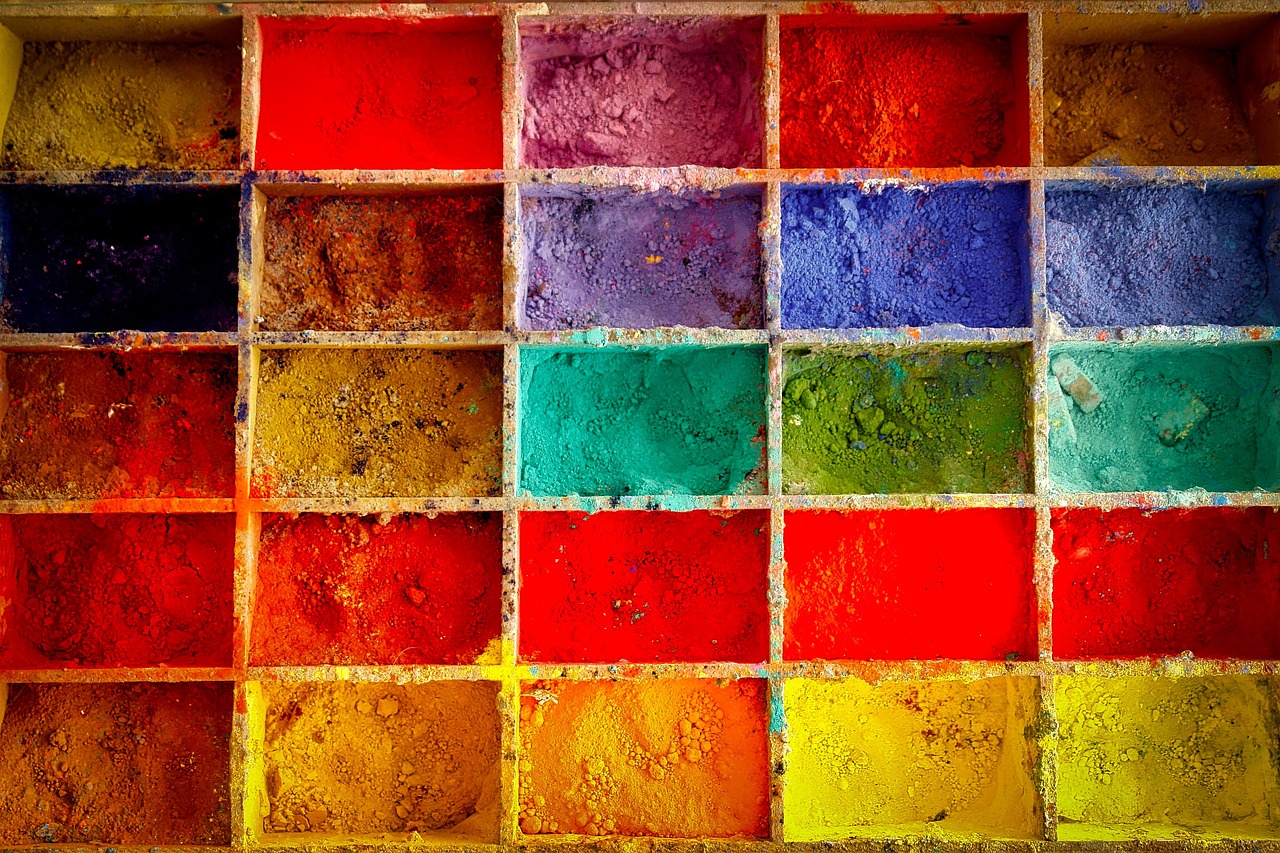
Colors are not just mere visual stimuli; they are laden with meaning and significance that varies dramatically across different cultures. This rich tapestry of interpretations shapes how individuals and societies perceive and interact with the world around them. For instance, while white is often associated with purity and peace in Western cultures, it can symbolize mourning and death in some Eastern cultures. This divergence highlights the profound impact that cultural context has on color perception.
Furthermore, the meanings attributed to colors can influence everything from art and fashion to branding and marketing strategies. In many African cultures, red is a powerful symbol of life and vitality, whereas in Western contexts, it might evoke feelings of danger or passion. Such variations underscore the importance of understanding cultural nuances when discussing color.
To illustrate this point, let’s take a look at a few colors and their interpretations across different cultures:
| Color | Western Interpretation | Eastern Interpretation | African Interpretation |
|---|---|---|---|
| Red | Passion, Danger | Good Fortune | Life, Vitality |
| White | Purity, Peace | Mourning, Death | Purity, Spirituality |
| Black | Elegance, Mourning | Power, Authority | Age, Wisdom |
| Green | Nature, Growth | Fertility, Harmony | Life, Prosperity |
This table illustrates just a fraction of the complex relationships between color and cultural interpretation. The meanings can shift dramatically based on context, making it essential for marketers and artists alike to consider cultural backgrounds when creating their works. For example, a marketing campaign that uses blue to evoke trust in one culture may not have the same effect in another where it could be associated with sadness or aloofness.
Moreover, the impact of color extends beyond mere symbolism; it can also affect emotions and behaviors. Research has shown that colors can influence mood and decision-making processes. For instance, studies indicate that warm colors, like yellow and orange, tend to create feelings of warmth and happiness, while cool colors, such as blue and green, can promote calmness and relaxation. This understanding is particularly important in fields such as design, where the choice of color can significantly affect user experience.
In conclusion, the cultural interpretations of color are as diverse as the cultures themselves. Understanding these interpretations not only enhances our appreciation of art and design but also enriches our interactions in an increasingly globalized world. As we navigate through various cultural landscapes, being mindful of how color is perceived can foster better communication and understanding among different societies.
- Why do colors have different meanings in different cultures?
The meanings of colors are shaped by historical, social, and environmental factors unique to each culture. - How can understanding color symbolism benefit marketers?
By understanding color symbolism, marketers can tailor their campaigns to resonate more effectively with their target audience. - Are there universal meanings attached to colors?
While some colors may have similar meanings across cultures, many interpretations are context-dependent and can vary widely.

Symbolism of Colors Across Cultures
The world of color is a vibrant tapestry woven with threads of cultural significance, emotional resonance, and historical context. Different cultures attribute unique meanings to colors, often reflecting their values, beliefs, and traditions. For instance, while white is commonly associated with purity and peace in many Western societies, it can symbolize mourning and death in some Eastern cultures. This duality of meaning showcases how color perception is deeply intertwined with cultural narratives.
In the realm of symbolism, colors can evoke a spectrum of emotions and ideas. Here are a few examples of how specific colors are interpreted across various cultures:
| Color | Western Meaning | Eastern Meaning |
|---|---|---|
| Red | Passion, Love | Good Fortune, Happiness |
| Blue | Calm, Trust | Immortality, Protection |
| Green | Nature, Growth | Fertility, Prosperity |
| Yellow | Happiness, Caution | Royalty, Courage |
As you can see from the table above, the meanings of colors can vary dramatically depending on cultural context. This divergence can lead to fascinating interactions, especially in our increasingly globalized world. For example, in marketing and branding, understanding these cultural nuances is crucial. A color that resonates positively in one culture might be perceived negatively in another, potentially leading to misunderstandings or failed campaigns.
Moreover, the impact of color symbolism extends beyond mere aesthetics; it influences social behavior, traditions, and even political movements. In many cultures, colors are deeply embedded in rituals and ceremonies. For instance, the color purple is often associated with royalty and power in Western contexts, while in some African cultures, it signifies wealth and status. This rich tapestry of meaning highlights how colors serve as a language of their own, capable of conveying complex ideas and emotions without uttering a single word.
In conclusion, the symbolism of colors across cultures is a testament to the diversity of human experience. Each hue carries its own story, shaped by historical events, social norms, and cultural beliefs. As we navigate through life, being aware of these meanings can enhance our understanding of the world and foster deeper connections with those around us. After all, color is not just about what we see; it's about what we feel and how we relate to one another in this colorful world.
- Why do colors have different meanings in different cultures?
Colors are influenced by cultural history, traditions, and social norms, which can lead to varying interpretations. - How can understanding color symbolism benefit businesses?
By understanding color meanings in different cultures, businesses can tailor their marketing strategies to resonate positively with their target audience. - Are there universal meanings for colors?
While some colors may have widely recognized meanings, context is key, and interpretations can vary significantly across cultures.

Impact of Color on Emotion and Behavior
Color is not just a visual experience; it profoundly affects our emotions and behaviors in ways we often overlook. Think about it: have you ever walked into a room painted in a soft blue and felt instantly calmer? Or perhaps you’ve been in a vibrant red space that made your heart race with excitement. This isn't mere coincidence; it's the psychology of color at work, influencing our moods, perceptions, and even our decisions.
Studies have shown that colors can evoke specific emotional responses. For instance, warm colors like red, orange, and yellow are often associated with feelings of warmth, comfort, and energy. In contrast, cool colors such as blue and green tend to promote feelings of calmness and serenity. This emotional spectrum can be harnessed in various fields, from interior design to marketing. For example, restaurants often use red and yellow in their decor to stimulate appetite and encourage quick dining, while spas may opt for pastel colors to create a relaxing atmosphere.
Moreover, the impact of color extends beyond individual emotions; it can also influence group dynamics and societal behaviors. In marketing, the right color choice can significantly affect consumer behavior. Research indicates that up to 90% of snap judgments made about products can be based on color alone. Brands like Coca-Cola have effectively used red to evoke excitement and energy, while Facebook uses blue to convey trust and dependability. This strategic use of color helps shape consumer perceptions and can ultimately drive purchasing decisions.
Interestingly, cultural context plays a crucial role in how colors are interpreted emotionally. For instance, while white is often associated with purity and peace in Western cultures, it can symbolize mourning and loss in some Eastern cultures. This divergence highlights the importance of understanding cultural nuances when considering the emotional impact of color.
To illustrate the relationship between color and emotion, consider the following table that summarizes common colors and their associated emotional responses:
| Color | Emotional Response |
|---|---|
| Red | Excitement, Passion, Energy |
| Blue | Calmness, Trust, Sadness |
| Yellow | Happiness, Optimism, Caution |
| Green | Growth, Harmony, Freshness |
| Purple | Luxury, Creativity, Mystery |
In conclusion, the impact of color on emotion and behavior is a fascinating intersection of psychology, culture, and personal experience. By being mindful of the colors we surround ourselves with, we can enhance our environments and influence our emotional states positively. Whether you are designing a space, choosing an outfit, or developing a marketing strategy, understanding the emotional language of color can lead to more intentional and impactful choices.
- How does color affect mood? Color can evoke specific emotions; for instance, warm colors can energize, while cool colors can calm.
- Can color influence decision-making? Yes, studies show that color can significantly impact consumer choices and behaviors.
- Are color associations universal? No, cultural contexts can alter the emotional meanings associated with colors.
- How can I use color to improve my environment? Consider the emotional responses you want to evoke and choose colors that align with those goals.
Frequently Asked Questions
- What is color perception?
Color perception is the process by which our eyes and brain interpret different wavelengths of light as distinct colors. It's a fascinating interplay between biology and psychology that shapes how we experience the world around us.
- How do we perceive color scientifically?
Scientifically, color perception involves the anatomy of the eye, particularly the cones in the retina that detect light. These cones send signals to the brain, which processes them into the colors we see. It’s like a well-orchestrated symphony where each instrument plays a crucial role in creating the final melody of color.
- Are colors perceived the same way by everyone?
No, color perception can vary significantly from person to person. Factors such as age, gender, and even cultural background can influence how we see and interpret colors. It's akin to how different people might taste the same dish and describe it in various ways!
- What role does the environment play in color perception?
The environment can dramatically alter our perception of color. Lighting conditions, surrounding colors, and even the context in which a color is viewed can change how we interpret it. Imagine looking at a sunset; the colors can shift depending on the atmosphere and your surroundings!
- What is color blindness?
Color blindness is a condition where individuals perceive colors differently than those with typical vision. This can lead to unique experiences of color, highlighting the variability in human perception. It's like viewing the world through a different lens!
- How does culture influence color perception?
Cultural interpretations of color can vary widely. For instance, while white is often associated with purity in Western cultures, it can symbolize mourning in some Eastern cultures. These differences shape how we interact with colors in art, fashion, and daily life.
- Can colors affect our emotions and behavior?
Yes! Research shows that colors can evoke specific emotions and influence behavior. For instance, red may increase energy and excitement, while blue can promote calmness. This is why marketers and designers carefully choose colors to elicit desired responses.
- How do artists use color in their work?
Artists often manipulate color to evoke emotions, create depth, and convey messages. Color choices in art can dramatically alter the viewer's experience, much like how a composer uses musical notes to stir feelings in their audience.